


Statistics
No matter how voluminous your data set, Realcore supports unlimited numbers of records and fields, as well as high volume queries. Our customizable charts, maps, reports and detailed insights enable you to display your data instantaneously.
1. System Overview
The system overview is Realcore’s dashboard that visualizes contact growth and engagement analytics

There are three cards on the top of this screen that reveal your number of contacts information including:
- Total number of your contacts
- Total number of contacts added in 24hr
- Total number of new contacts that you have not read

Contacts on last 7 days
This report indicates the number of your contact day by day on the last 7 days.

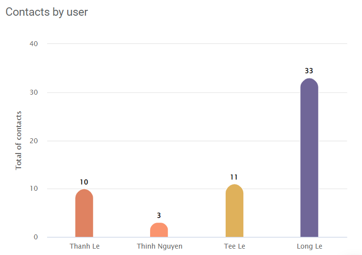
Contacts by user
This report is only displayed if you are a company admin user that indicates the number of contacts belonging to each user in your company.
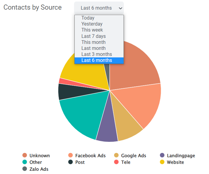
Contacts by Source
Contact source is one of the most important metrics that let you know the percentage of each source that your contacts come from.
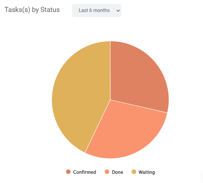
Tasks(s) by Status
If you are a company admin user who assigns tasks to users in your company. This report can help to monitor the current status of all tasks then you can know how many tasks are done or pending.
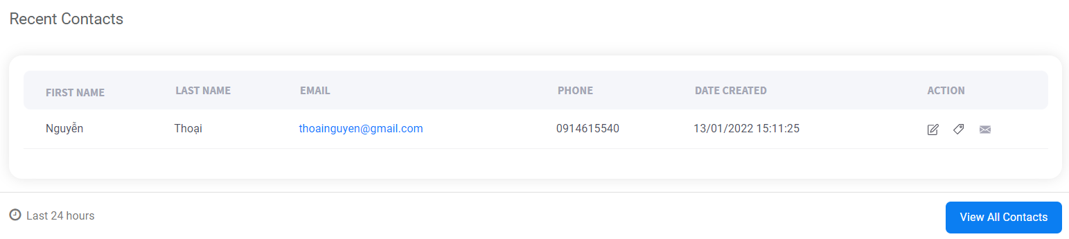
Recent Contacts
Recent contacts display all recent contacts created in the last 24 hours that enable you to interact with new customers easily.
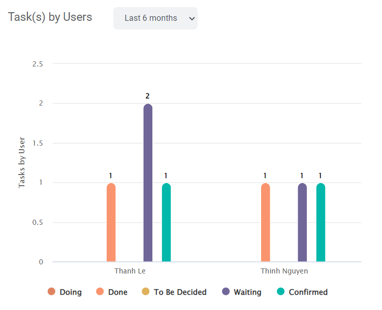
Task(s) by Users
This report is a column chart that reveals the current status of tasks assigned to each user in your company that is grouped by tasks’ status.
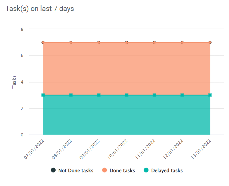
Task(s) on last 7 days
This report indicates the variation of all tasks in your company on last 7 days by an area chart.
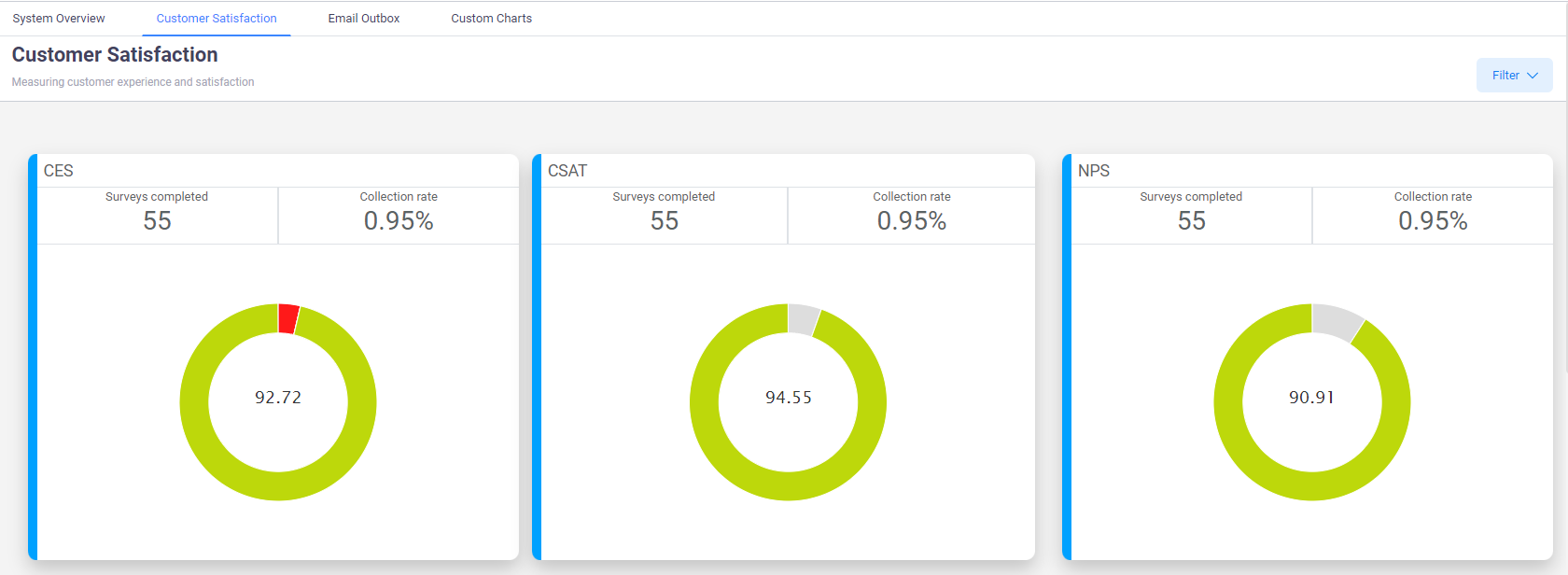
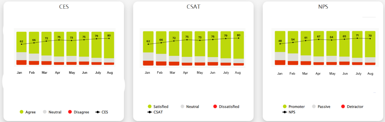
2. Customer Satisfaction
Realcore’s Customer Satisfaction dashboards are the most advanced analytics platform for CX measurement by customer journey, improving customer loyalty and reducing customer churn.
There are three cards on the top of this dashboard that visualize your customer satisfaction across time calculated based on all the value of these fields in your contact data, the value of each color can be explained as below:
- NPS:
- Detractor (Red color): 0 – 6
- Passive (Grey color): 7 – 8
- Promoter (Green color): 9 – 10
- CAST:
- Dissatisfied (Red color): 1 – 2
- Neutral (Grey color): 3
- Satisfied (Green color): 4 – 5
- CES:
- Disagree (Red color): 4 – 5
- Neutral (Grey color): 3
- Agree (Green color): 1 – 2
The next three cards include some column charts to display the average score of each field during each month in the current year based on a formula specified for each field.
- NPS: (total contacts have NPS value equal to 9 or 10)/(total contacts have NPS value * 100) – (total contacts have NPS value in 0 – 6)/(total contacts have NPS value * 100)
- CSAT: (total contacts have CSAT value equal to 4 or 5)/(total contacts have CSAT value ) * 100
- CES: (total contacts have CES value equal to 1 or 2)/(total contacts have CES value * 100) – (total contacts have CES value equal to 4 or 5)/(total contacts have CES value * 100)
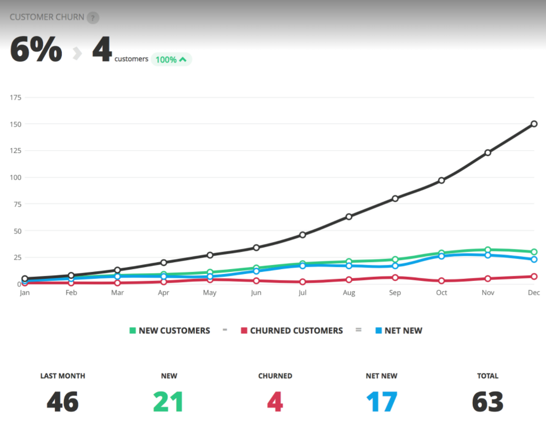
The final chart of this dashboard is the Customer Churn chart that visualizes the ratio of customers that stopped using your company’s product or service monthly based on the “Unsubscribe” field.
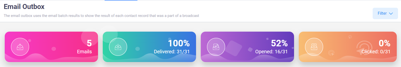
3. Email outbox
The email outbox uses the email batch results to show the result of each contact record that was a part of a broadcast.
On top of this dashboard is the summary information of your email broadcast including:
- The total email broadcasts that have been sent out
- The percentage of delivered emails per total emails
- The percentage of opened emails per delivered emails
- The percentage of emails that contact clicked to its link per delivered emails
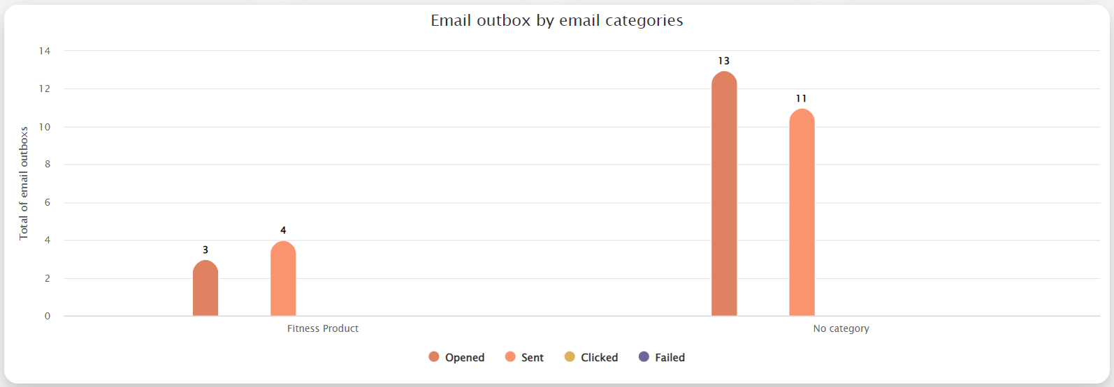
 The next chart is a columns chart that indicates the number of emails by status (opened, sent, clicked, failed) grouped by email categories.
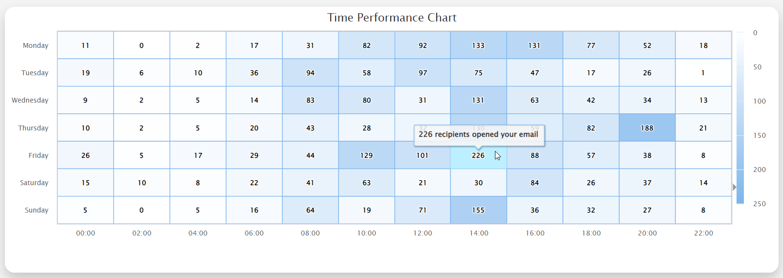
With the time performance chart below, you can easily analyze and optimize with our email send-time. This chart is a heat map that reveals how many contacts opened your emails at each hour on each day of the week. Therefore, you can know when is the best time to send out emails to your contacts.
On the bottom of this dashboard is a table that displays all of your email broadcasts with the summary information in each row. You can also export this table to a CSV file by clicking on the “Export CSV” button.
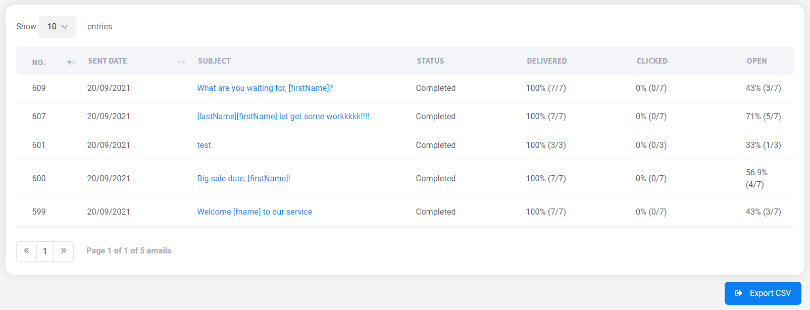
If you want to know the detailed information of an email broadcast, you can click on the subject in each row that will redirect you to the email outbox detail screen that displays all information related to this email broadcast including:
- All recipients
- All recipients who opened your email
- All recipients who clicked a link inside your email
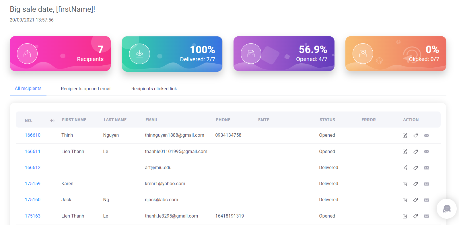
Additionally, you can see which link inside your email the contact clicked on.

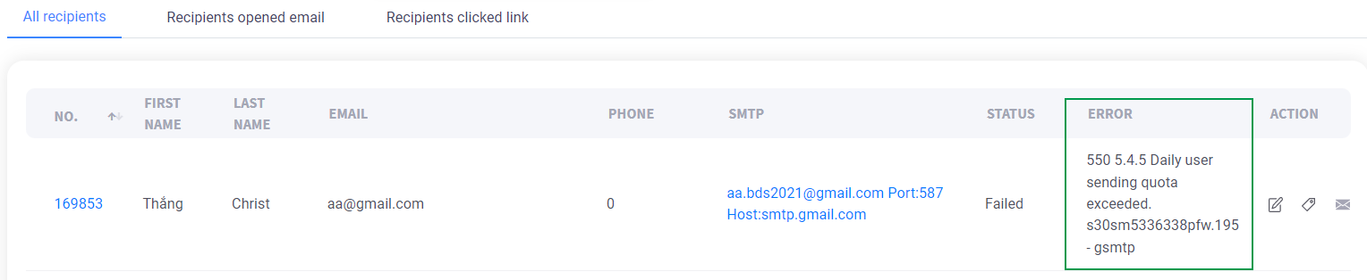
When an email can not be sent, we will display the error message that can help you to troubleshoot easily.
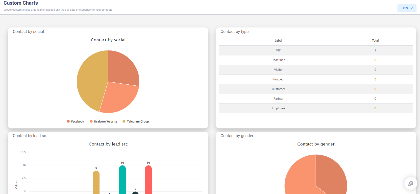
4. Custom charts
In case no chart above matches your requirement, you can customize your own chart using Realcore’s custom charts feature.
You can access Settings -> Statistic Configuration -> Custom Charts Configuration to create custom charts.
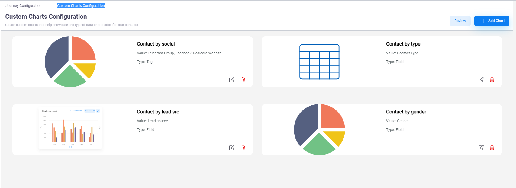
At the create new custom chart screen, you will need to select a tag or a field, and type of your chart (pie chart, column chart, or table).
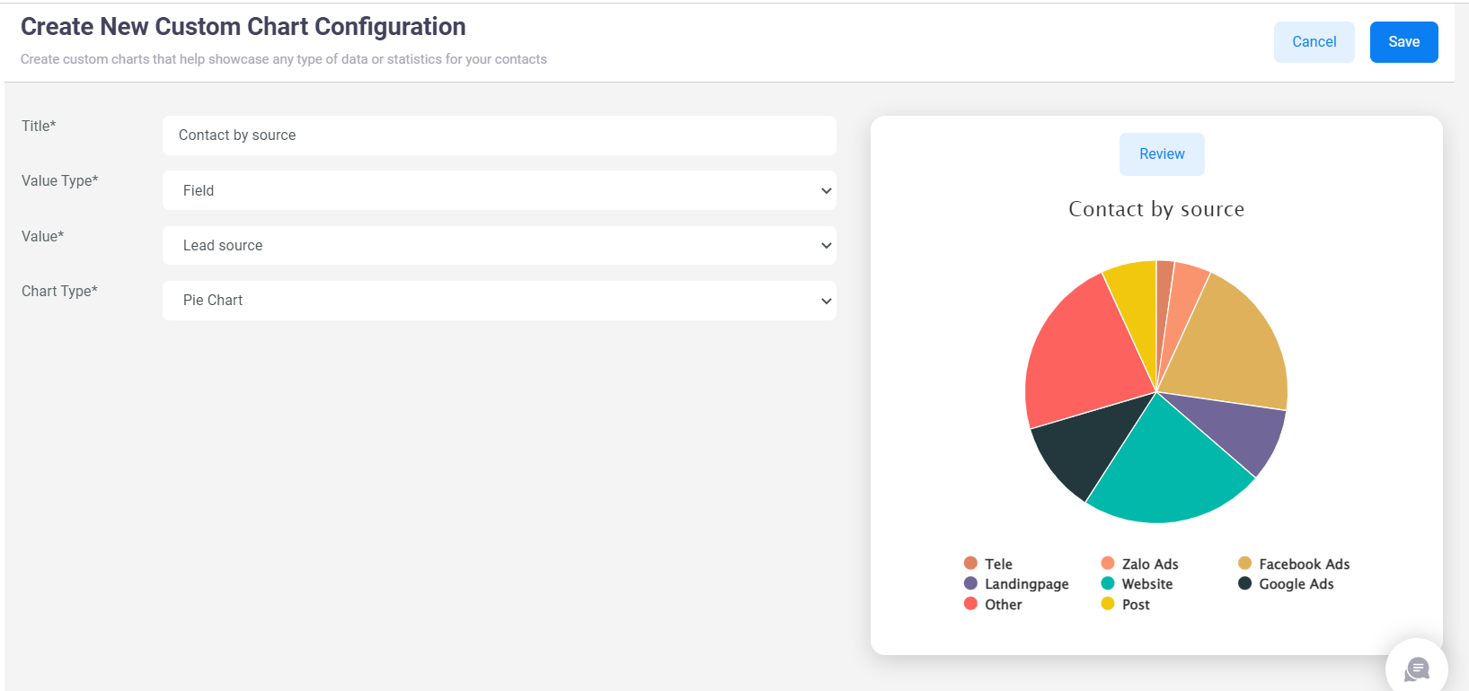
Your created custom charts will be displayed at Analysis -> Statistics -> Custom Charts.